
Hess Design Works has been working closely with Chef Palmer not only for Aureole New York and Las Vegas, but for many of his other highly successful ventures. Paintings, graphics, menu designs, signage, dinnerware, advertising, invitations, promotion, packaging as well as advise and strategy have all been requested and supplied by Hess Design Works.
Hess Design Works created the logo, stationary package, menus, signage, promotion package including copy writing and company identity for this progressive, sophisticated eatery.
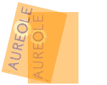
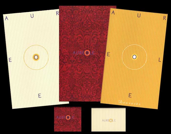
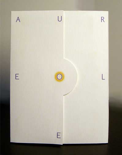
The word 'aureole' means a saintly glow or halo-like surrounding.
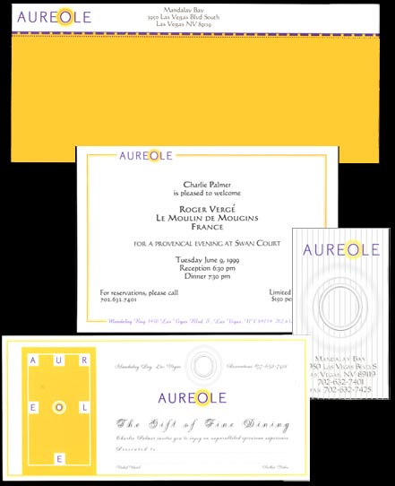
Hess Design Works used a yellow halo effect around the 'O' which also visually serves as a target to give the logo emphasis and distinction. The continued use of yellow provides a unifying feature to many Aureole collateral items such as bags (above), envelopes, cards, invitations, menus, gift certificates, etc.
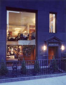
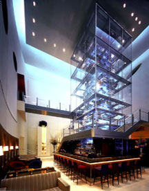
Aureole: NYC facade and Las Vegas Wine Tower
Aureole Swan Court menu; Las Vegas
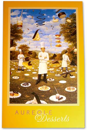
Aureole Desserts menu with "Heavenly Desserts" painting by Mark Hess
Aureole Las Vegas brochure
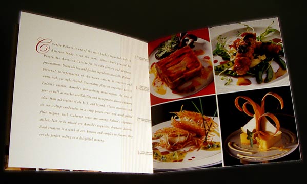
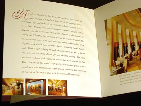
An Aureole brochure/sales tool introducing the sumptuous new Las Vegas venue featuring the incredible interior design, including the 40 foot high wine tower, waterfall and swan lagoon.
Hess Design Works worked closely with architect Adam Tihany to mirror the contemporary finesse and exotic luxury of the setting with multiply paper stock, gorgeous photos, classic design and delicious writing.
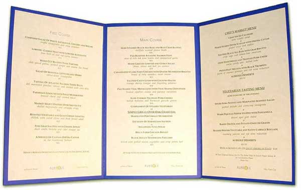
Hess Design Works developed a special technique for manufacturing the menus using various paper stocks and coatings to make each one durable, easily cleanable while allowing the printed interiors to be changed daily.
Matches are slim wood in a simulated ridged stock and for nonsmokers a match-like pack of note papers makes a nice keepsake.
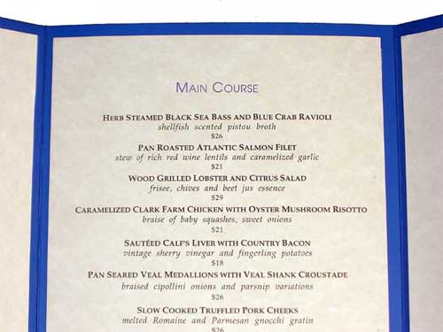
The typography in a menu is extremely important in establishing the ambiance and style for your guests; it must flow easily and be easy to read and understand. Above is an example of simple elegant type treatments that can be printed in house every day and attached with a special medium sticky two sided tape.
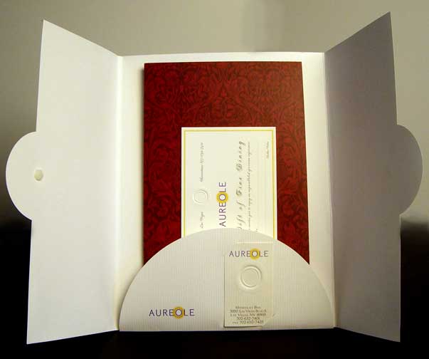
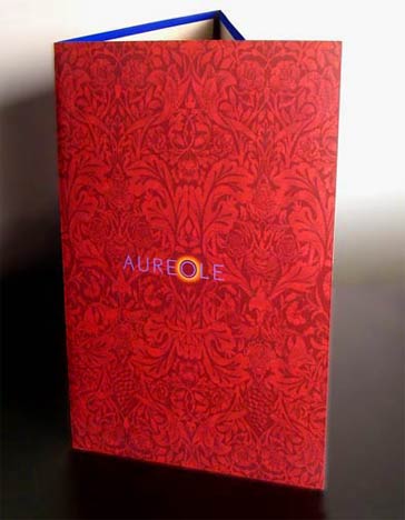
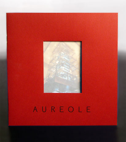
The AUREOLE Press Kit (above) exudes the same special feeling the interior design establishes to create a unified personality and ambiance; a brand. With a circular theme inspired by the halo effect in the logo, the traditional folder turns into a surprising treat for the individuals who recieve it. Closed with a small Velcro fastener, produced with vertical ribbed paper and sporting a business card with embossed halo; this is not your typical folder. And the price per unit is extremely low.
The use of vertically ridged paper, sharp typography and embossed 'halos' adds to the feeling of elegance and sophistication yet is very economical.
Hess Design Works strives for the highest quality results while keeping the cost down.
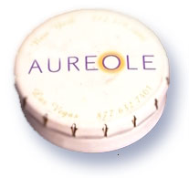
Aureole mints
Give us a call and let's discuss the possibilities.
9 1 4 + 2 3 2 + 5 8 7 0